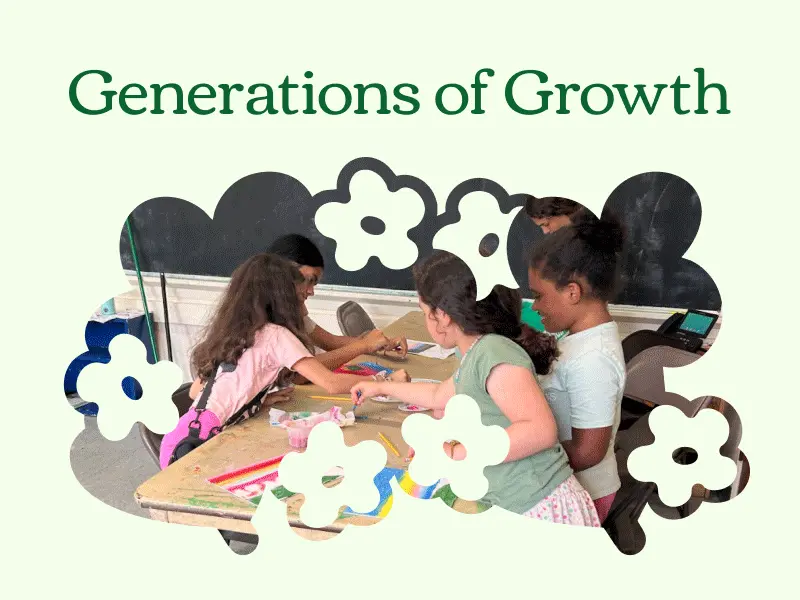
Generations of Growth
ROLE
Website UI/UX Designer
Website Developer
TIMELINE
14 weeks
(Jul - Oct 2025)
TOOLS
Figma, Wix Studio, Adobe Illustrator
Constructing a vibrant, wholesome brand and website for Generations of Growth to thrive and serve the community.

Overview
01
about
A budding nonprofit focused on community wellness and intergenerational connection
Generations of Growth, a nonprofit based in the Greater Boston area, empowers youth and seniors through research-backed wellness classes that promote physical, mental, and emotional health. Founded in 2025, they sought to build a website to establish themselves, showcase their work, and connect with more community members and volunteers.
role
Designing and launching Generations of Growth's website and visual identity
As a Web Design Consultant at Be All You, I met with Ella, the founder of Generations of Growth, regularly to discuss art direction, align on content and copywriting, and gather feedback. Since Generations of Growth also lacked a visual identity, the project deliverables expanded to include a complete visual identity and logo suite that reflected their commitment to intergenerational wellness.
Working as the sole designer, my responsibilities spanned multiple design disciplines, from UI/UX design to visual design, and had me exploring website development (by way of Wix Studio).
problem statement
How might we effectively showcase Generations of Growth and encourage users of all ages to enroll in community programs?
design solution & highlights
Give a warm welcome to Generations of Growth!


A gentle, inviting home page dedicated to showcasing the community and mission
From the start, users are introduced to Generations of Growth's mission, offerings, and community by way of a simple and easy-to-navigate layout, presented with a warm and inviting visual language.

Program offerings backed by research
"Research-backed" isn't just a claim — Generations of Growth features a Research page detailing exactly how their art, fitness, and meditation classes can benefit the community physically, mentally, and emotionally.

A friendly, down-to-earth, and vibrant look for Generations of Growth to thrive
The new visual identity features a playful flower logomark, bright and warm colors, and blooms of various scales and colors to represent their intergenerational audience and commitment to community wellness.
Design
02
moodboard
Establishing the art direction and discussing layouts
Given the mission and audience of Generations of Growth, I put together a moodboard filled with warm and comforting pops of color anchored around green, floral logomarks (as a nod to the founder's initial logo concept), and simple website layouts. Further discussions with the founder cemented the idea that the visual language should be centered on warmth and steadiness while the website should be accessible and easy to navigate for students and seniors alike.


The moodboard I presented to the founder, focusing on the colors, general tone, and home page layouts.
design system
Vibrant, lively, and comforting colors that invite growth
The color palette for Generations of Growth revolves around green as the primary color, given its strong connections to growth, wellness, and balance. I combined this with four secondary colors — each with a vivid and pastel shade — to introduce pops of color that would make the palette more youthful and vibrant. While the green alone is calming, it's alongside the pinks, oranges, yellows, and blues that the palette as a whole feels like spring: reflective of growth, renewal, and transformation.

The color palette for Generations of Growth, featuring 4 variants of the primary green, 4 secondary colors (and lighter shades), and 2 dark tones.
Friendly typefaces that are easy on the eye
Just as the colors served to make Generations of Growth more inviting, the typefaces were meant to do the same. As the primary and secondary typefaces respectively, Corben and Livvic both feature handwriting-like quirks that come off as open and friendly; together, they're a perfect blend of personal, easy to read, and professional.

Corben and Livvic, the primary and secondary typeface, with the entire alphabet — upper and lowercase — featured alongside numbers.
Buds and blooms, of all colors and sizes, that represent generations
I also produced a couple of design elements to represent different parts of the audience — full flowers resembling 'g's and small blooms — and the community — varying scales of masks and 'bouquets' — throughout the site.

The buds and blooms that make up the logo, along with the fuller image masks resembling flowering bushes.
logo suite
A soft and simple logomark that highlights interconnection
With the logo, I wanted to build off of the founder's initial logo concept, which featured a bundle of larkspurs, lilies, tulips, and daisies, and retain the imagery of multiple flowers to highlight community and diversity. I also knew that I wanted to keep it simple and playful, so that it'd be easily recognized and well received by students.
The final logomark is made up of three flowers — 2 'g' shaped flowers with stems connected by a smaller bloom — to represent connection between generations and act as a play on 'gog', the acronym for Generations of Growth.


The final logo suite, in light and dark variations. Here, the logomark is combined with Corben, a friendly serif typeface and the primary typeface for Generations of Growth, to offset the overall youthfulness.
website
Fully responsive, easy to navigate, and ready to build a more connected community

The completed platform's home page, built on Wix Studio! To scroll through, hover or click the image above (it'll take some time) or visit the full site!
Reflections
03
what i learned
Website development is hard, but I work harder
Learning something new always comes with a bit of an adjustment time, which was especially true for me when it came to Wix Studio. Fortunately, I didn't spend too much time struggling — experience with Framer and Webflow helped — but the moments spent slowly translating Figma auto-layout groups into Wix's layout configurations, fixing oddly fluctuating properties between breakpoints, and dearly missing the fit-to-content option were certainly formative! (I have never loved auto-layout quite like this before.)
New tools aside, this was the first project where I had a hand in design and development, which has definitely affected parts of my design process for the better. Now, more of the hi-fi designs happens directly in the platform I use to implement, which makes it easier to course-correct designs, work around platform constraints, test responsiveness, and add interactive animations.
next steps
A launch is never a farewell, just a see you later
While the Generations of Growth website has been launched and handed off to the founder, there's a lot that can still be done in terms of user testing and more content! We had a wonderful time working together, and I'm still in touch for future updates, so stay tuned!


